Designing museums by Peter Higgins

Peter Higgins, Landdesignstudio in London
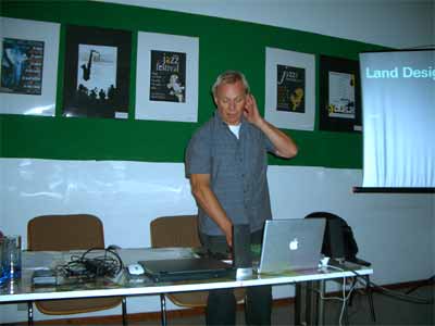
At the first summer school in Volos, Peter Higgins narrated what Land Design Studio has gained in experiences by having developed numerous museum projects.
Land Design works together with other companies, architects and consultancies so that this collaborative work brings about creative processes. This approach is an integral part of their work philosophy.
The generic company profile includes: Process/ Architecture/ Master planning / Interpretation/ Objects/ Graphics/ Time Based Media/ New media/ Electro Mechanical Interactivity / Collateral material
Examples:
National Waterfront Museum in Swansea 1
Land Design has been involved in the genesis of the National Waterfront Museum in Swansea, a museum dedicated to the post 1850's birth and demise and rebirth of the world's first industrial nation: Wales. Outstanding feature is the link between a restored Victorian railway shed and the new building. By working with Wilkinson Eyre the master planning of the museum coincided with how the studio unfolded the “narrative / interpretive process”. Peter Higgins names this as “the unfolding of the archive” while content, building and location need to go together in order to fulfil the mission of any museum. In the case of the NWMS there is one road leading directly to the centre of the city.
Since Swansea is tucked behind some former coal mining areas and located after Cardiff, it was a challenge to envision such a museum capable of attracting sufficient number of visitors to warrant the investment of more than 31 Million pounds.
UK EXPO ’95 Pavilion 2
Of interest is that Land Design Studio used a Japanese designer to make sure all items are accessible to people of the Japanese culture. The theme was about ‘man and nature’. The official text explaining the work speaks about imitation and contrast to mark cultural differences to not merely experiences made possible by interrelating the virtual with the real, but by bringing about a new context of understanding touches upon ‘experiences’ not to be forgotten.
The starting premise for the design is that
- “nature is both simple and complex. So is our relationship with it. This dynamic is hard to communicate through a short visit in an Expo environment.”
- “The journey begins in a garden where visitors are encouraged to protect and to nurture the East. Visitors then move through to interior displays that show how we can draw inspiration from the natural world and work with it in innovative ways. A leaf-filigree screen encloses a woodland garden of 40 lime trees standing amongst a range of British ferns, grasses and seasonal flowers.”
- “The garden is a unique setting for seven renowned contemporary British artists to reflect on current global environmental issues. Collectively, the installations challenge visitors to consider the fragile nature of our planet and the ecologically damaging effects of human activities.”
- “As a complete contrast, visitors enter the darkened pavilion interior to encounter artworks based on British skies and British birdsong. The space opens up to reveal an overhead projection of simple shadow animations of natural forms, such as bats, geckos and waves. Each refers to an exhibit situated below. These hands-on interactive modules showcase striking technological innovations developed by British scientists, all inspired by nature.” 3
Of interest is that the exhibits had to be designed in such a way that at least 20 000 visitors could go through the pavilion per day. It means that each item would have to be curtailed time wise to even 45 seconds before finished with the interaction and thereby forcing the person to move on.
National Maritime Museum Cornwell
Here the concept was ideal as the building could be constructed according to what collection of boats were already available. Since not all boats could be exhibited at once, Land Design Studio in collaboration with the architectures gave the mold for the building so that ships hanging could be easily inter exchanged one year later. In that way visitors would be attracted since the permanent collection would be renewed on a yearly basis.
Petra Gateway, Jordan

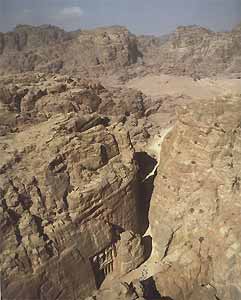
Petra is a magical place for the other-worldliness of its topography and geology alone. The power of this landscape must have inspired the Nabateans to make it their sacred home, carving the rock over many centuries to create their city. This is in direct contrast to the 20th century additions that have arisen piecemeal around the site, to meet the demands of tourism.
PROJECT: A New Gateway to Petra
LOCATION: Jordan, World Heritage site
DATE: 2003
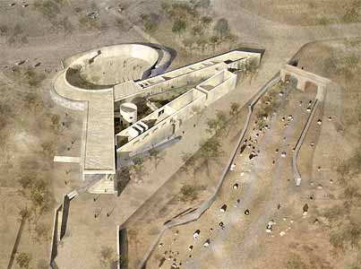
ECA led a joint venture with Jordanian multidisciplinary firm Bitar Consultants and London based interpretation designers Land Design Studio to redevelop the visitor facilities to the ancient Nabatean city of Petra in Jordan, with funding from the World Bank. 4

Subsequently a project was launched to alter the world heritage site by constructing instead of a museum per say a visitor centre with an amphitheatre. The real aim is to increase the number of visitors who prefer to stay over night rather than come and leave by bus as part of a more complex tour. What impact this will have on both the world heritage site and the kinds of experiences made when reinforced now by a visiting centre containing both a slow and a fast lane, needs to be evaluated.
Peter Higgins pointed out that this museum has a fast and slow lane (very much like the Wielandt Museum by Weimar). Moreover he wanted to illustrate what difficulties are presented to any designer if a museum or visiting centre has not just one entrance and one exit but many entrances and equally exists. This means the visitors flow has to be guided quite differently. Museum design involves floor plans.
It is said that the collaboration between Land Design Studio and the Edward Cullinan Architects has brought about “an unprecedented opportunity to incorporate interpretation into the creative process of what has become a sophisticated architectural solution” and by “establishing a real understanding of the ‘narrative’” to be told through such a museum new methods have been developed that “help inform issues of sequencing, massing, lighting and even the sensitive use of materials”. Consequently Land Design Studio “believes that this model will set International Standards for other World Heritage Sites in how to maintain architectural quality that not only respects critical issues of sensitive siting and functionality, but also acknowledges the value of communication media for the all important visitor.” 5
Criticism of the visitor centre which has been created:
Nevertheless the travel journal Guardian asks how far will we go to attract tourists? It asked the architecture correspondent Jonathan Glancey to choose the best and worst additions to the world's landscapes. He wrote the following about Petra Gateway in Jordan: “Petra needs no introduction other than the "Siq", the narrow fissure that leads from the new town into the wondrous rose-red city hidden among rocks. Now, it has been decided to tell tourists more about what they can see for themselves, or study in books, by constructing an elaborate new visitor centre. While there has been nothing wrong in the choice of designer - Edward Cullinan Architects from London, an intelligent and sensitive practice - why does Petra need such an attraction? The argument in favour is that the complex will allow tourists to bypass the tat that has sprouted in their name all too close to this world heritage site. It will also control the flow of visitors to the Nabatean city. Yet, no matter how sensitive the design, it makes Petra, like Stonehenge, all too like the proverbial dog wagged by its tail.” 6
« Museums of the future and future work in museums - discussion in Volos 2006 | Access to museums by Socrates Kabouropoulos »
